Anyway, we'll start today's post with her new direction. My original take on the whole thing was to be a bit more cartoony about it, and her original take was to be more detailed with the illustrations. Well, the simpler path won here. It is just easier to do cartoony illustrations. Here are my wife's first "cartoony" sketches:
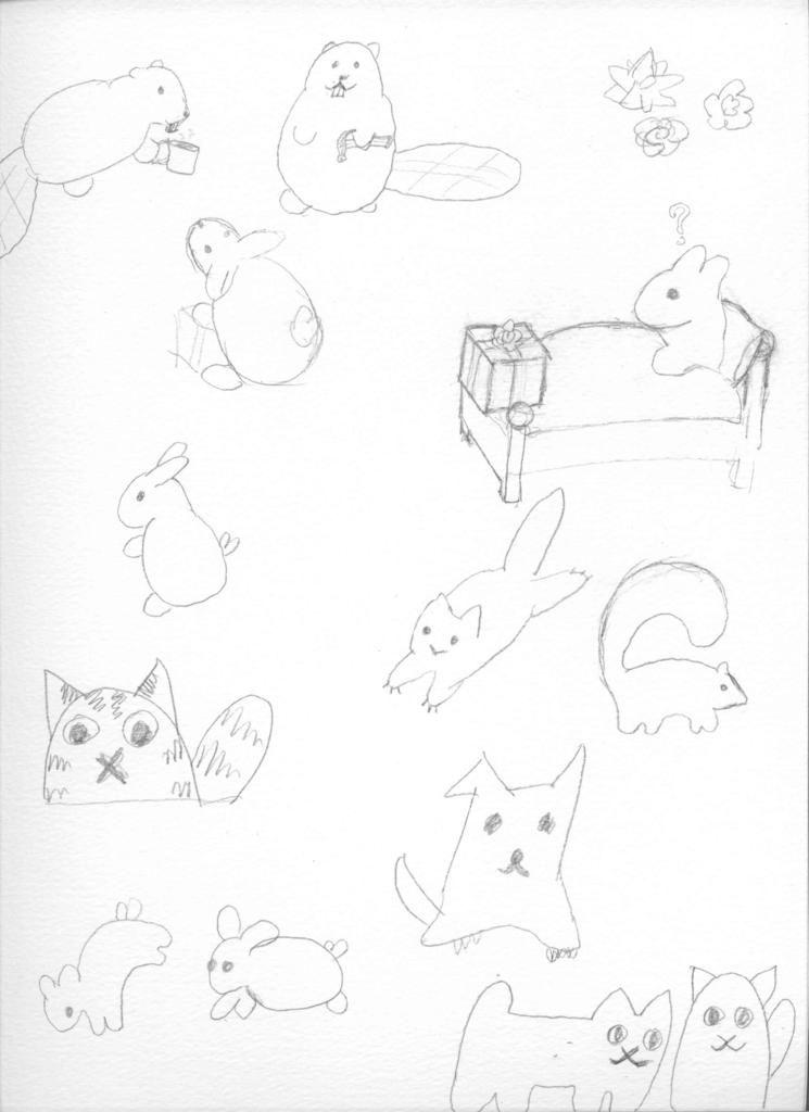
I want her to practice the art of the abstract protagonist. Its a technique that I read about in Scott McCloud's Understanding Comics. It's where you keep your main character as un-detailed as possible. The less detail in your main character, the easier it is for your reader to identify with them. In this case, we want potential birthmothers to be "the bunny". So the more abstract and cartoony the bunny is, the better.
Once my wife settled on a style, she went to work picking her tools. She decided to draw the opening panel -- the one with the bunny in bed and a present at her feet.

She also is playing around with drawing her parents -- the beavers. She wants to depict her father as a builder, hence the hammer. I want her to draw him with a cup of coffee in his hand -- since he is from Portland (and he drinks a lot of coffee). I also want her to draw a bald beaver, but she doesn't want to do it.
Somewhere along the way she lost faith in her ability to draw a bow. She didn't want to do the simple two hoops and two strings. I told her to draw a carnation (the flower) and that would do for a bow. Personally however, I prefer the simple two hoop bow. My wife went with the carnation approach.
Next she dabbled in watercolors:
The watercolor paper gets all warped when you use water colors on it, hence all the picture distortion. You can see she played with various bedspread types. It was important to her to get the blanket properly designed.
In the end she went with watercolors over pencil drawing and then re-inked to highlight the illustration. She also went with a thicker, more textured charcoal drawing paper. [Edit: My wife corrected me here. She says that the paper that warped was charcoal drawing paper, the un-warped paper is watercolor paper. Oops! I guess that makes more sense, now that I think about it.]
Here is her first take on the first illustration:
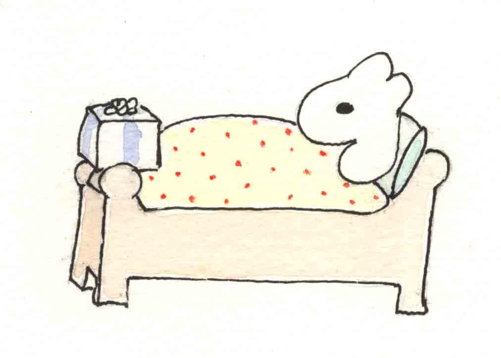
She didn't like how the bunny turned out in this one. Here is her second take:
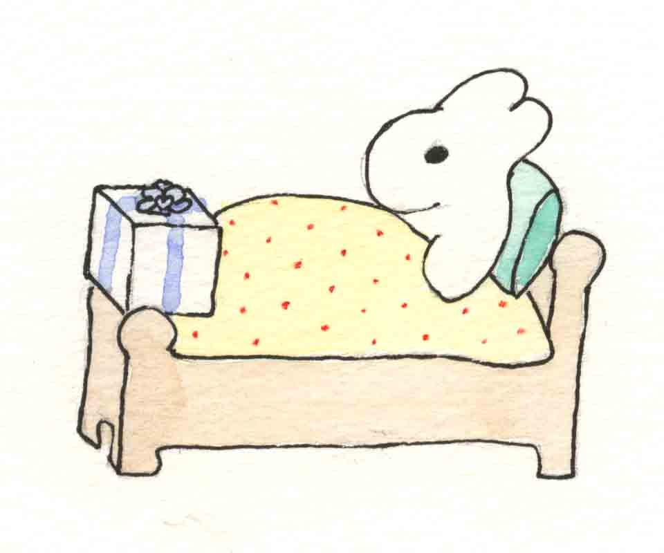
This is the one we are going with. I dig the blanket.
1 comment:
I consider myself lucky if I can draw a bath. I wish you every best thing in the book.
Me
Post a Comment